Monday, October 10, 2022

Guest on the Frame Center Podcast - so much fun!


Last week I visited The Frame Center, in Hanover MA as a guest on their podcast. What a treat! Owner, Dave Petty, is easy to chat with, and we've known one another for a number of years.  We talked about owning original art, juried shows, local North River Arts Society, among other things.  Dave and his crew at The Frame Center do a terrific job with custom framing.  At the end of my visit, Dave asked me to describe a framed piece I have at home that is a favorite.  Of course, I described two.  

Firstly, I inherited a pair of pastel portraits of me and my brother, Kevin.  They hung over our home mantel for many years, in ornate antique gold frames my mother picked up at her favorite framing spot/antique store in Boston.  I remember going with her as a girl, onto a road that dead-ended at the railroad tracks.  We walked up a flight and entered a majestic room overflowing with antiques and art.  I was maybe ten years old, so my memory of the place is fuzzy.  I think Boston's Copley Place may be on top of that spot now.  When the portraits became mine, I took them to the Frame Center where they dismantled them, used archival matting and backboard, and museum glass.  The portraits now hang together again in my home.

Secondly, when Steve and I were married, my bridesmaids gave us the gift of heading to Maine choose a painting by Alfred "Chip" Chadbourn, of Yarmouth, ME.  We picked a beautiful painting of Stonington and we cherish it. 


Here is a link to the Casual Confabs with Jody Regan, or look for The Frame Center podcast wherever you find your podcasts.  As I said, it was a treat.  I hope to visit again. 


Pastel of Kevin by Joanne F. Regan


"Stonington" oil on canvas by Alfred Chadbourn

Sunday, July 03, 2022

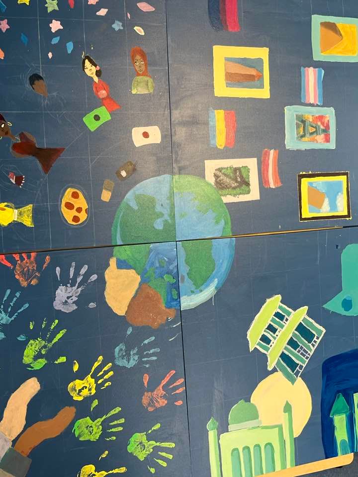
"Diversity Rocks" 6 x 6 acrylic on canvas


Each teacher at the South Shore Charter Public School teaches their content area (middle school Math in my case) and also teaches a project.  The projects are service learning-based, meaning the students learn skills necessary to fulfill a need of the local or greater community.  This year, my art project was asked if we would like to create a mural for the back wall of the school library with the theme "Celebrating Diversity".  My project students were enthused, and we embarked on a series of design discussions, division into teams, design sessions followed by group critique to refine their ideas.  The space measures 6 x 6 feet.  We decided to create the mural on canvas rather than the wall itself in case the library was ever reconfigured.  Our discussions resulted in a decision to show religious, racial, cultural, and global diversity.  The students arranged themselves into teams, and began working.  They chose a globe as the unifying element in the center of the mural. What did they learn?

Giving and receiving constructive criticism, scaling up, color mixing, perspective, vibrating color within a value range, teamwork, among other things. 

 This is the finished product.  The students are thrilled with their effort, as they should be.  The mural was assigned a new home behind the front desk in the entryway of the school where it is seen every day as the students enter.  See our process photos below.

 Thanks for looking.  You know I appreciate your comments

Adding hand prints to racial diversity quadrant

painting flesh tones

global and gender diversity


scaling up the racial diversity quadrant

measuring where the central globe will fit


Sunday, May 01, 2022

"Sunny Day" 8 x 8 oil on board


The Girls Just Wanna Paint theme for April is "festive". This is my interpretation.  Throughout the months, especially during winter, I will often bring a bundle of sunflowers home from the local grocery and put them in the window.  Each time I pass through the room, I get a little festive zing from their angles, the sun bouncing off the petals, and the reflected light inside and/or beneath them.  Each flower has its own personality.  

I used a photo reference of sunflowers on my porch for this painting; taking what I needed for the design.  Here are some process photos:

Reference photo: you can see how I adjusted the design for this square

Blocking in, laying down the lightest and darkest notes

Added in the background, a cooler, neutralized green; good time to carve out the edges of each sunflower; making sure nothing was too symmetrical

More modeling in the darks, the leaves.  I softened a bunch of edges, added dappled sunlight onto the flower below and the leaves, implying depth.  Looked for areas to push elements behind other elements to create depth, and vibrated color into the center of the top right flower.

As always, thanks for looking. You know I love your comments.  

Saturday, March 26, 2022

San Miguel de Allende

I spent this year's February vacation in San Miguel de Allende, Guanajuato, Mexico. with my friends Kelley Macdonald and Paula Villanova who were running their "San Miguel Painting Adventure with Kelley and Paula" workshop.  It was magical.  A month later, my senses are still activated by the sights, colors, sounds, tastes, and the feel of the air.  I loved this week spent with my daughter and with friends old and new.

Can't wait to go again.

"At Le Jardin" watercolor & ink 11 x 14 - sitting in the canopy of shade trees, this view of La Parroquia is mesmerizing, changing colors as the sun moves.

"Looking Up" ink and watercolor - watching people while sitting in the garden outside Templo de San Francisco.
"Cafe y Churros" ink and watercolor - lovely spot for a cafe, people watching and naturally, churros

"Back Patio" ink & watercolor - rooftops from our hotel's rooftop deck

"Lavaderos del Chorro" ink & watercolor - lovely historic spot where women would gather to wash the clothes. 


Saturday, July 03, 2021

"Sanctuary" oil on board 12 x 16


"Sanctuary" is a view of Houghton's Pond in Milton, MA.  I painted it as a commission and a surprise, for the daughter of a friend (also a friend).  Her partner (who I had not met) reached out to me to ask if I would paint this spot which is special to the two of them.  He wanted to surprise her on their first anniversary.  Of course I agreed; what a romantic gift!    He sent me a few photos, and some guidance such as "the rock is very important".  

Here are some process photos. I wanted the painting to convey the feeling of this special place, wooded, yet bright, secluded from the public and inviting.  I loved the backlit photos I was provided.   I began the painting with an orange and red underpainting, in anticipation of all the greens to come.  You can see that I moved a couple of the trees around on the right side, to make the composition balanced, but asymmetrical.  

I saved my lightest light for hint of clouds, and for the sun dappled onto a few of the leaves in the middle ground.  The clouds are slightly neutralized and slightly cool, which leaves room for the leaves to stand out against the sky.  

  And, I designed the light to draw your eye to the right center, pulling you down across the surface of the rock, then along the light/shadow pattern on the ground, then up the trees, down the branches and back to the right center.  The goal was to keep you engaged in this special place. 

I warmed the sides of the trees away from the light, where they were reflecting onto one another, softened all the hard edges of tree to sky to indicate the light as it surrounds the trees.  Then I vibrated some cools onto the distant land masses to push them farther away.  I left spots of the underpainting showing through purposely to to add luminescence.  

Turns out the surprise was a great success, and I got to meet the partner in person, and he's just as great as his gesture led me to believe he would be.

 Thank you for looking.  You know I love your comments. 


Monday, May 31, 2021

"Moon in June" oil on board 12 x 14


This month's theme for Girls Just Wanna Paint is "June".  While contemplating what to paint, one of my daily drawing images popped into my head, and I remembered being on the Scituate Lighthouse Jetty at dusk while people awaited the rise of the full moon.  There is usually a crowd, families, photographers, individuals, with lots of quiet chatter. Then, the moon reveals itself along the horizon, and there is a moment of hush.  On the right night, with the sun just setting behind, there is a spirituality in that space.  

I dug up my drawing, shown here.. 

It is ink with some watercolor and gouache.  I used the drawing a source for my painting "Moon in June", adapting the people and the mood.  I began the painting with a warm undertone as the painting would be dark and cool. As you can see in the progress photo, I began with very dark silhouettes of the people on the jetty.  I added the moon very early, a slightly tinted white, to establish it as the lightest light, then gradually lifted the people and the jetty gently out of the dark, intending to the tell the story of night beginning.

As always, thank you for looking, and you know I love your comments and questions.