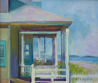
Yesterday's class was about cropping as part of your design. Cropping your subject can bring energy, dynamism, excitement to the painting. I advise my students, "Don't crop because something doesn't fit!". Use cropping, as you apply yourself to all other aspects of your painting, with intentionality; with deliberation. It's a matter of granularity. The design needs to be as considered and deliberate as does each stroke of the brush.
Back to cropping. Many new painters are reluctant to cross over the edge of the painting surface. That's natural; there is a boundary there. It can be intimidating. I use yesterday's exercise to crush that reluctance, by having the class fly across the edges with power and intention. We discuss rookie ways of approaching the edge of a painting. There's the tried and true squashed bottles, flowers hunching down below the top edge, or bending and bowing to the sides of a painting, the disproportionate rooftops and miniscule chimneys. It can become a bit like Marcel Marceau trapped in the invisible box of his own design. Most of us have been there at one time or another.
Next, there are the "edge kissers". Not deterred by the approaching border, these painters move fearlessly in that direction; then stop abruptly as the object touches the edge. The subject matter may still be clinging to the picture space, but the viewer's eye finds this alluring tangent irresistible and follows it faithfully to the edge and BEYOND, (pardon the Buzz Lightyear reference), leaving the painting with alacrity!
Yesterday's exercise was to design a painting which boldly crosses at least 1/3 of a horizontal edge, and 1/3 of a vertical edge. No bending, no squashing, no kissing. Several students use view finders to examine the subject. Some of those view finders had large openings, 4" x 5" for example, that didn't allow the artist to extend their arm far enough to really see the subject cropped. Make sure your viewfinder has a small opening, and make sure the opening is adjustable. Bring it close to your eye to see more; extend to see less. If you are unaccustomed to cropping your subject, you need to see LESS than you are used to.
The class drew thumbnail sketches; then I advised them to look at the sketches through the viewfinder. We had a few "Ah, Hah!" moments, and the result was some great design; and everyone breaking the surface tension that the edges can create. The result is that you bring the viewer into the middle of the painting. It's fascinating to see the shapes in the middle of a garden; or porch, or bouquet of flowers, or to bring your viewer into the middle of a still life. Dynamism. Burst across the edges of your painting surface. Break free; with intention.
Next post: Negative space.


Good one Jody. We could all think more about this.
ReplyDeleteThis a a valuable lesson and a terrific post about it! Thank you for sharing! You inspired me to fool
ReplyDeletearound with some new compositions! Great examples.
Jody, I learned a lot from our class on cropping. Ironically, we may lament about what to paint, when we could paint our "same ol' favorites" with a new cropping! Thank you.
ReplyDeleteThis was a great idea for a class- or for a whole series of classes. I love the beautiful painting of the red onion.
ReplyDeleteFabulous post and lesson.
ReplyDeleteI've been unavailable on Fridays but I'm watching.
Thanks so much for your generosity and that red onion kicks butt!
Great lesson and post Jody! We've all been there :)
ReplyDelete