Saturday, July 03, 2021

"Sanctuary" oil on board 12 x 16


"Sanctuary" is a view of Houghton's Pond in Milton, MA.  I painted it as a commission and a surprise, for the daughter of a friend (also a friend).  Her partner (who I had not met) reached out to me to ask if I would paint this spot which is special to the two of them.  He wanted to surprise her on their first anniversary.  Of course I agreed; what a romantic gift!    He sent me a few photos, and some guidance such as "the rock is very important".  

Here are some process photos. I wanted the painting to convey the feeling of this special place, wooded, yet bright, secluded from the public and inviting.  I loved the backlit photos I was provided.   I began the painting with an orange and red underpainting, in anticipation of all the greens to come.  You can see that I moved a couple of the trees around on the right side, to make the composition balanced, but asymmetrical.  

I saved my lightest light for hint of clouds, and for the sun dappled onto a few of the leaves in the middle ground.  The clouds are slightly neutralized and slightly cool, which leaves room for the leaves to stand out against the sky.  

  And, I designed the light to draw your eye to the right center, pulling you down across the surface of the rock, then along the light/shadow pattern on the ground, then up the trees, down the branches and back to the right center.  The goal was to keep you engaged in this special place. 

I warmed the sides of the trees away from the light, where they were reflecting onto one another, softened all the hard edges of tree to sky to indicate the light as it surrounds the trees.  Then I vibrated some cools onto the distant land masses to push them farther away.  I left spots of the underpainting showing through purposely to to add luminescence.  

Turns out the surprise was a great success, and I got to meet the partner in person, and he's just as great as his gesture led me to believe he would be.

 Thank you for looking.  You know I love your comments. 


Monday, May 31, 2021

"Moon in June" oil on board 12 x 14


This month's theme for Girls Just Wanna Paint is "June".  While contemplating what to paint, one of my daily drawing images popped into my head, and I remembered being on the Scituate Lighthouse Jetty at dusk while people awaited the rise of the full moon.  There is usually a crowd, families, photographers, individuals, with lots of quiet chatter. Then, the moon reveals itself along the horizon, and there is a moment of hush.  On the right night, with the sun just setting behind, there is a spirituality in that space.  

I dug up my drawing, shown here.. 

It is ink with some watercolor and gouache.  I used the drawing a source for my painting "Moon in June", adapting the people and the mood.  I began the painting with a warm undertone as the painting would be dark and cool. As you can see in the progress photo, I began with very dark silhouettes of the people on the jetty.  I added the moon very early, a slightly tinted white, to establish it as the lightest light, then gradually lifted the people and the jetty gently out of the dark, intending to the tell the story of night beginning.

As always, thank you for looking, and you know I love your comments and questions.  

Wednesday, March 31, 2021

100 People in a Week


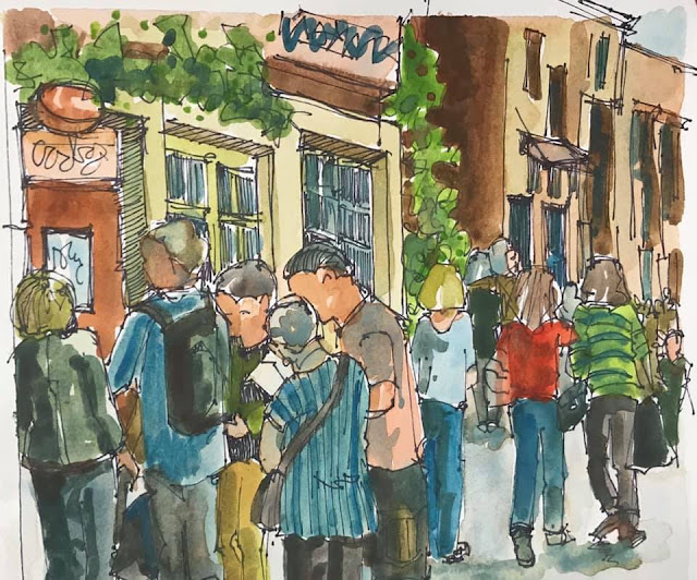
  A few weeks ago I took on the #100peopleinaweek challenge.  Some of my drawings are from photos, but many of the people are those I saw out in public, such as the first drawing above, from the Arnold Arboretum.  What a beautiful day for walking with my daughter. You can also see my drawing from inside our church sanctuary, and inside the Museum of Fine Arts.   It was a great exercise, and I plan to do more.  


Sunday, January 31, 2021

"Three Cities in Three Days" ink & watercolor 8 x 9 - randomly chosen palette


The Girls Just Wanna Paint challenge for January was "3 random colors".  I used watercolor, and blindly pointed at three corners of my watercolor palette, which is arranged by color/temperature.  By aiming at three different areas of the palette, I knew I was getting a bit of variety.  I chose vermilion, sap green, and cerulean (see picture).  My first instinct was to pick again, but I wanted to maintain the integrity of the challenge and learn something.  Here are a few thoughts from this challenge

  • None of these colors is very cool, so I needed to adjust my temperature scale
  • The most yellow I could achieve was with sap green with a little vermiliion.
  • I could make beautiful neutrals, browns, grays, using these three colors. 
  • The darkest I could get was a charcoal-ish blue gray but if I pushed it a tiny bit beyond its neutral balance, I was into an orange or green or blue (not really neutral anymore, and not as dark as I wanted.)
  • I adjusted my buildings to look a little terracotta colored, so maybe Italy or Spain, based on the colors I could achieve.  
  • When I used vermilion on its own, as a color option, it was much too strong and overpowered the other options.  There is nothing in this composition that I wanted drawing your eye that much, so I neutralized all the vermilion I used.
  • I enjoyed the challenge, and will randomly choose three colors again to see what happens  
Take a look at all the Girls Just Wanna Paint interpretations of the theme by clicking the link. 

Friday, January 01, 2021

"A New Day" 9 x 9 oil


 The woods where we live are filled with trails.  I recently discovered the "All Trails" ap for my phone.  There are thousands of trails listed, with reviews, information including distance, elevation, difficulty, and a route which you can track using your phone's GPS.  On a recent walk, I was rewarded with this view, before descending to a dock along the river.  The brisk winter air, the quiet, and sumptuous visuals reminded me that we are entering a new year, and each day is fresh.  You can see my progress photos below.  

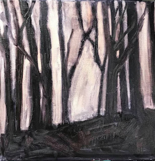
I began by tinting my canvas with a dark neutral.  I leaned it toward the cooler side, knowing I would warm the trees later, implying the late day sun bouncing from tree to tree within the woods. Then I wiped away everything in light, carefully designing the tree shapes, and leaving them a little heavy as I intended to cut in on them when I applied the light.  


Then I added my lightest light note.  It is a white, slightly tinted with cad yellow.


I began to add layers of color starting with the intense warms, and the blues of the sky.  The chroma neutralizes as the distance grows from the sun, either vertically or horizontally.  Because the sun is so low, the tops of the clouds are darker, and shades of purple.  I used the purple to enhance the value of lighter spots in they sky.  And, I began to soften the edges of the trees against the sky, banding their edges, as light will do. 


In the final passes, I warmed the ground where the light was scooting across it, and softened the edge of the sky to ground, implying another layer of land out there.  

Lastly, I added a hint of smaller branches throughout the trees.  These are almost obscured by the intense light, but still evident. 

It's a new day.  Let's take each one as it comes.  Thank you for looking.